Why Professional Design in Children Books Matters
Key Takeaways
- In a crowded market, the cover is often the first and only chance to attract attention, instantly communicating genre, age range, and quality to both children and their parents.
- Thoughtful page composition and well-chosen fonts guide the reader’s eye, create natural rhythm, and ensure that young readers can enjoy the story without feeling overwhelmed or distracted.
- Design choices such as child-friendly fonts, proper spacing, and strong contrast help beginning readers stay focused, build confidence, and engage more easily with the story.
- A polished, professionally designed children’s book is more likely to be trusted by distributors/reviewers, and to lay a strong visual foundation for future titles in a series.
You have spent months, perhaps years, perfecting your manuscript. Or, you may have found the heart of your story and polished every word. However, in the competitive world of publishing, a great story is only half the battle.
The visual presentation of your children’s book, the layout, the font choice, and the cover, is what ultimately bridges the gap between your imagination and the reader’s reality. Investing in professional design for children’s books is not a luxury. It is a necessity!
Why? Because in a market where thousands of titles are released monthly, your book needs to look as good as it reads. This guide will help you explore how professional design elevates a simple story into a cohesive, enchanting experience.
First Impressions and Professional Design in Children Books
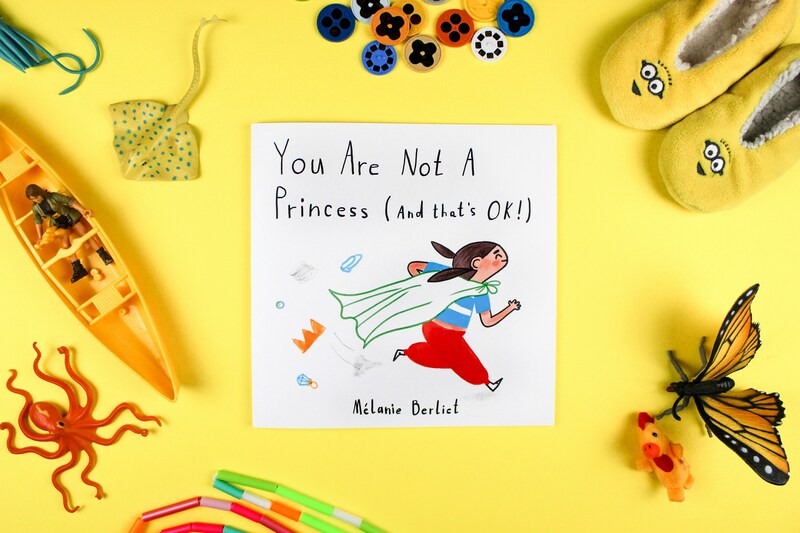
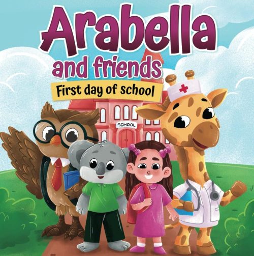
A vivid example of how professional book design attracts attention by blending compelling title text with vibrant imagery.
We are always told not to judge a book by its cover, right? However, children (and their parents) do exactly that. The cover is the “handshake” between the author and the audience. For this, professional design in children’s books helps us create a strong first impression.
A professional designer can understand color theory and “shelf appeal.” They will know how to balance the title, the author’s name, and the central illustration so that nothing feels cluttered. A DIY cover often suffers from poor contrast or “boring” fonts, which can make a masterpiece look amateur.
More importantly, when you prioritize professional design in children’s books, you definitely signal to readers that the content is high-quality and worth their time.
How Design Enhances Storytelling
Design is more than just making things look “pretty”; it is a form of silent storytelling. A designer will decide where the text sits in relation to the characters. They use “white space” to give the reader’s eyes a rest during quiet moments or use “dynamic layouts” where text follows the curve of a hill or the blast of a rocket to create energy.
Without professional design in children’s books, the text can often feel like an afterthought, tacked on to the art. A professional can also ensure a “symbiotic” relationship between the two. They make sure that the most important parts of the illustration aren’t obscured by a text box and that the page turns create a natural, rhythmic flow that keeps a child engaged.
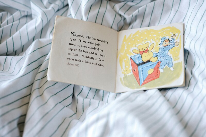
This book demonstrates design that supports early readers—clear type, engaging layout, and friendly illustrations that help children engage with both text and image.
Accessibility: A Core Element of Professional Design in Children Books
One often overlooked aspect of professional design in children’s books is technical accessibility. Children learning to read have specific needs that differ from those of adult readers.
- Font Choice: Designers select “sans-serif” or specific “infant” fonts where letters like ‘a’ and ‘g’ look the way children are taught to write them in school.
- Leading and Kerning: This refers to the space between lines and letters. If the text is too cramped, a child with dyslexia or a beginning reader will struggle to track the words.
- Contrast: Ensuring the text color pops against the background is a hallmark of professional design in children’s books. Text should never be placed over a busy, multicolored background, as it becomes “camouflaged.”
Working With Designers and Illustrators
Many authors wonder if they should be the “boss” of the design process. While it is your story, professional design in children’s books thrives on collaboration. Designers can bring a different set of skills to the table. They understand “bleed” (the area trimmed off during printing), “gutter loss” (the space lost in the middle fold), and CMYK color profiles for print.
When working with a professional, you must provide them with your “vision,” but leave room for their expertise. They might suggest a different trim size or a specific paper finish (such as spot UV or matte lamination) to make your book feel more premium. In addition, trusting the professional design process for children’s books often yields creative solutions you might not have considered on your own.
The Long-Term Value of Professional Design in Children Books
A book with a professional design in children’s books has a much longer shelf life as well. It is more likely to be picked up by libraries, stocked by independent bookstores, and reviewed by major publications. Reviewers and distributors often dismiss self-published books simply because the design looks “self-made.”
Furthermore, if you plan to turn your book into a series, a professional designer can create a “template” or a visual brand. This will make sure that your Book 2 and Book 3 look like they belong in the same family, making it easier for fans to find your work.
Ultimately, professional design in children’s books is an investment in your career as an author, not just an expense for a single project.
Conclusion: Investing in Professional Design in Children Books
The “magic” of a children’s book is a delicate balance of words, art, and structure. While your words provide the soul, it is the design that provides the body. By committing to professional design for children’s books, you ensure that your message is clear, your story is accessible, and your book has a better chance in a crowded market.
So, don’t let your wonderful story be overshadowed by poor layout or visuals. Give your book the professional finish it deserves so it can fulfill its true purpose: to capture the hearts and imaginations of young readers everywhere.
If you’re ready to bring your story to life, professional illustration and book design can make all the difference. Discover how we, Mehibi Studio, can help transform your children’s book into a visually engaging, market-ready creation that young readers will love. You can also find inspiration in our latest projects on Instagram at @mehibiverse.